Comparing Your New Genome to Existing Neighbors
In this tutorial, we discuss a common task when working with a new private genome run through the Comprehensive Genome Analysis Service– comparing the genome to its close neighbors. In this example, we will look at the results of a comprehensive genome analysis run for the NCBI SRA sample SRR8179889. The sample was assembled into contigs and then annotated as a Streptococcus pyogenes (from which the sample was cultured).
The output of the pipeline looks like this
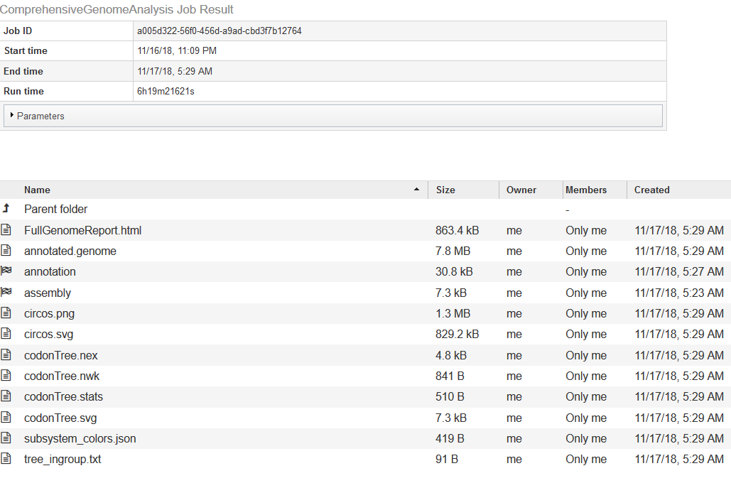
The Full Genome Report contains a lengthy text analysis (with tables and diagrams) of the genome and its annotation. Among the diagrams will be a phylogenetic tree showing the new genome’s relationship to its neighbors. The list of neighbors will be in the text file tree_ingroup.txt.
Checking the Annotation Quality
If you double-click on annotation, it will take you to the annotation job for the new genome.
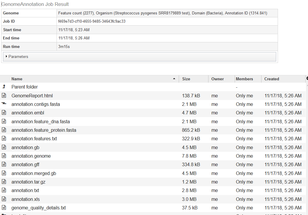
The quality analysis of the genome can be found in GenomeReport.html. The summary at the top is shown below.
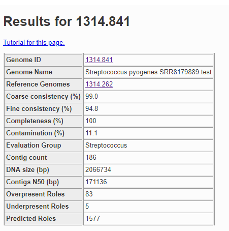
The contamination score in this case is 11.1%, and anything more than 10% is considered a red flag. Below is a fragment of the problematic roles report from the quality analysis.
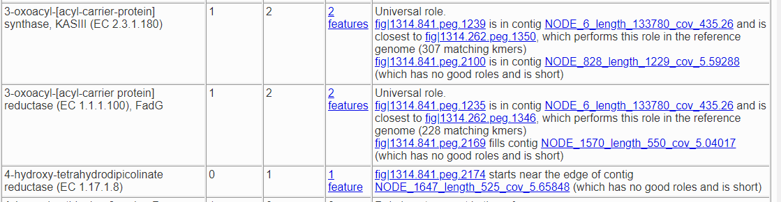
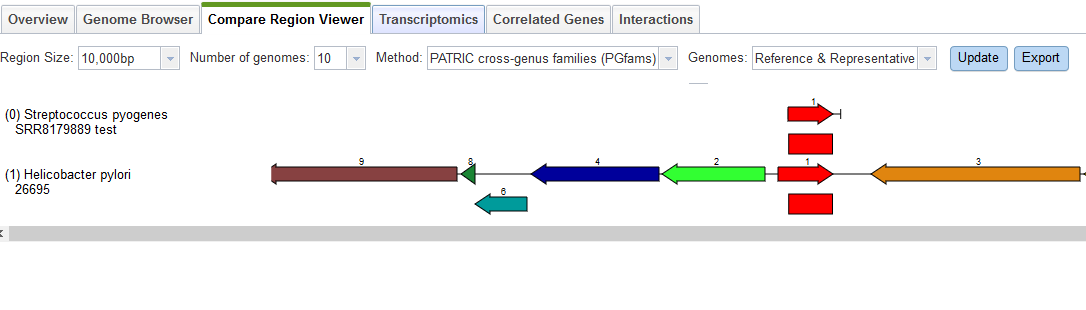
Here we have two roles that should only occur once but actually appear twice, and one role which should not occur but was found once. Both of the roles that are duplicated have a version that matches the corresponding role in the reference genome and one that does not. So, fig|1314.841.peg.1239 is likely correct, because it matches a feature with that role in the reference genome for this species, but fig|1314.841.peg.2100 is suspect because it does not. To find out what it does match, we click on the link for it, which takes us to the Compare Regions display.
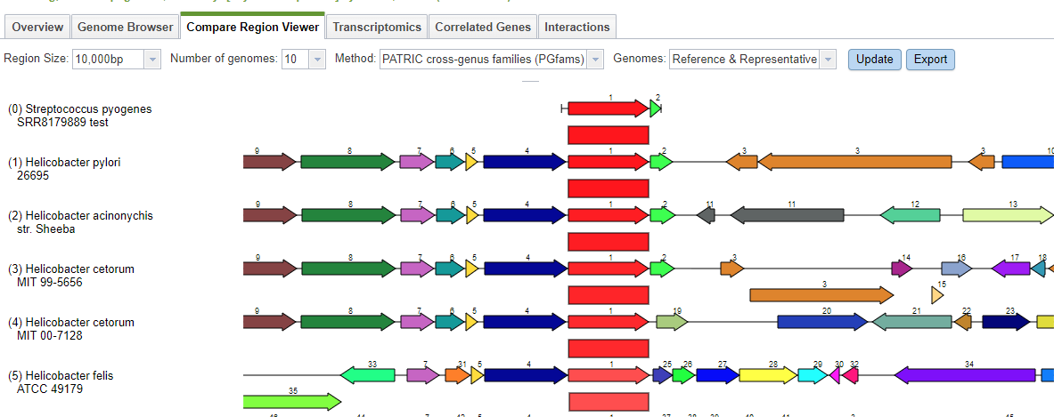
The Compare Regions view uses protein familes to link features together. The gene we selected– fig|1314.841.peg.2100– is shown in red on the first line. The closest proteins in the same family are shown in red on the lower lines. Each red protein is surrounded by its neighborhood on the contig, and all proteins are color-coded and numbered by family. So, all the dark blue proteins with the number 4 belong to the same family, and are generally found near our protein of interest. What we see clearly from this display is that our protein of interest in our new genome is more like something found in Helicobacter than in Streptococcus pyogenes.
A similar search using the other two suspect features returns the same result. We can conclude the extra DNA in our original sample is from Helicobacter.
A Visual Comparison Using the Protein Family Sorter
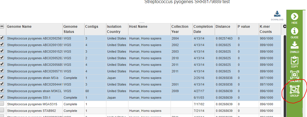
We would now like to compare the genome directly to its close neighbors using the Protein Family Sorter Service. The Protein Family Sorter requires you to enter genomes one at a time unless they are already in a genome group. First we need to find the closest neighbors in PATRIC. The Comprehensive Genome Analysis found a set suitable for generating a phylogenetic tree, but these are not necessarily the closest. Using the Similar Genome Finder Service, we can get a list of the 50 or so closest genomes. We will select the first 10 and put them into a genome group using the Group icon.
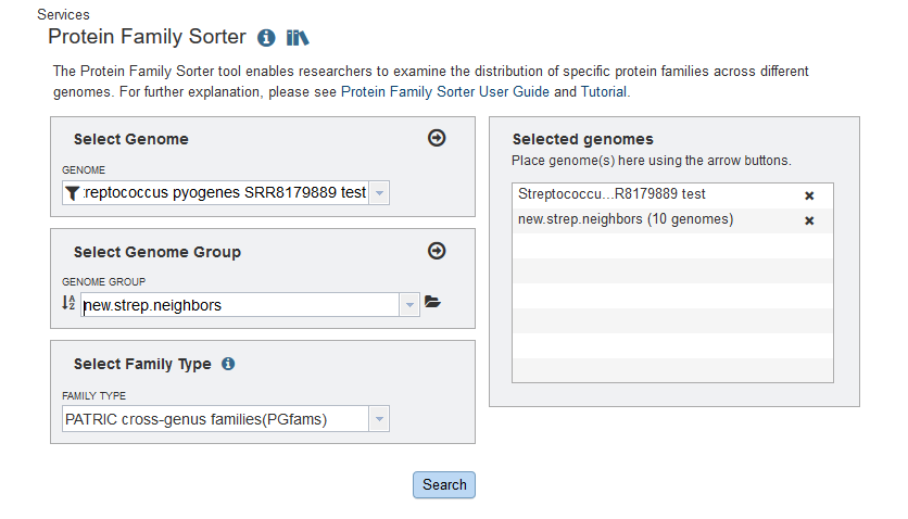
We are now ready to invoke the Protein Family Sorter. In the screen shot below, we entered the new genome as an individual, and new.strep.neighbors is the name of the genome group of close neighbors we just created.
The Protein Family Sorter produces a tabular analysis and a heatmap. The heatmap is shown below.
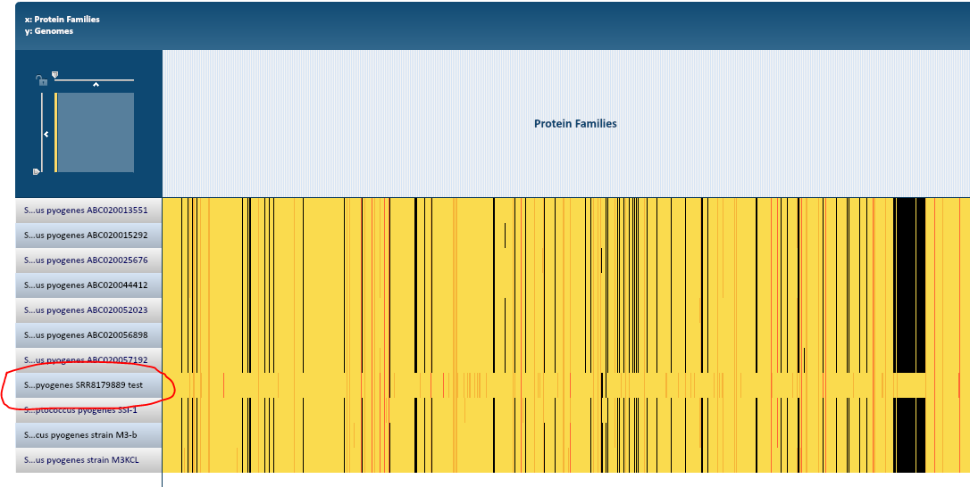
At this resolution, every protein family is a vertical line. Black indicates there is no protein in the family. Yellow indicates there is one and only one protein from that family in the genome, and when there is more than one a shade of orange is shown. Each row represents a genome, and our new genome stands out dramatically.
You can scale the display so that the columns are wide enough to see the protein family names. You can also click on an individual protein. We would like to see one of the proteins that is in the new genome but does not have family members in the neighboring genomes. Every part of the diagram is clickable, and you can even drag-select a whole region. Clicking on part of the yellow band inside the big black vertical bar produced the pop-up below.
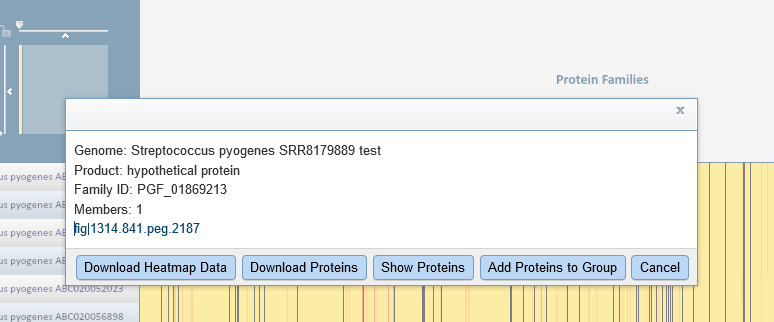
You can click on the feature link to see it in Feature View. Selecting the Compare Regions tab shows us that this particular protein belongs in Helicobacter pylori.
This confirms what we learned from the quality report: the sample contains some Helicobacter DNA.